get in touch
The Problem With Making Everything Stand Out

Why too much emphasis weakens your website
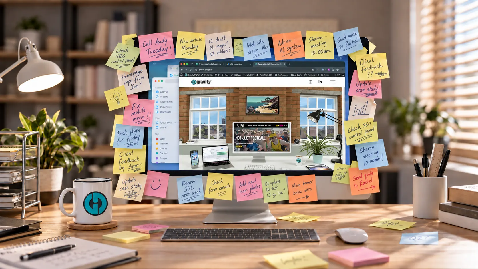
Imagine a computer monitor with a single yellow Post-it note stuck to one corner. Your eye goes straight to it, even before you have read what it says.
Now cover the same monitor with hundreds of Post-it notes. Each note may still matter, but the effect has changed. Nothing has priority because everything is asking for attention at once.
Websites often develop in much the same way.
How a clear page becomes a crowded one
Most clutter is not the result of one obviously poor decision. It builds gradually through a series of perfectly understandable requests.
Sales want the quotation button to be more prominent. Marketing need space for a campaign. Recruitment want to advertise vacancies. Someone else asks for a newsletter pop-up, while a senior manager wants an award near the top. Then there is a live-chat tab, an announcement bar and a special offer.
Considered separately, each request may be reasonable. The problem appears when they are added without reconsidering the page as a whole. The website becomes a collection of internal priorities rather than a clear experience for the visitor.
Giving visitors a clear order of importance
Visual hierarchy is simply the order in which a design draws attention to things. Visitors should be able to understand what a page is about, which information matters most and what they can do next.
It works best when visitors barely notice it. The page title establishes the subject, supporting content explains it and the main action is easy to find. Secondary options remain available without demanding equal attention.
Problems arise when several elements are given the same weight. A page might have a large red enquiry button, a bright green download button and a blue subscription panel. Add two promotional banners and a pop-up, and visitors have to decide what deserves attention before they can engage with the content.
The same issue can occur without bright colours. Oversized headings, excessive bold text and heavy borders can all compete. Bold text is useful because it contrasts with the surrounding copy. If whole paragraphs are emphasised, that distinction disappears.
When navigation tries to do too much
The same principle applies to navigation. Mega menus, the large dropdown panels used to show several groups of links, can help visitors find their way through a substantial product range. But the available space does not all need filling.
A menu labelled Products should primarily show products, categories or ranges. Detailed features, benefits and explanations belong on the product pages. The menu’s job is to help visitors find what they need, not give them a sales pitch.
Keep related links in clearly labelled groups. Support information and resources should not be scattered among product names, leaving visitors to work out which links lead where.
A simple menu can still contain plenty of products. What matters is that people can scan it and choose a destination without first reading a page’s worth of content.
More calls to action can produce less action
Adding another call to action can feel like a harmless way to increase opportunity. If one button generates enquiries, it is tempting to assume that several buttons offering different routes will generate more.
But those routes need to make sense together. Someone ready to request a quotation may hesitate when also offered a consultation, a brochure, a product finder and a live chat. Should they book a consultation before asking for a price? Will the brochure answer their question?
Some visitors will work it out. Others may postpone the decision or leave. Another button has given them another choice, without necessarily helping them move forward.
Different visitors do need different options. A brochure might suit someone researching, while an enquiry button serves someone ready to speak. Both can be useful without receiving identical prominence. A solid button for the main action and a quieter text link for the alternative can make that relationship clearer.
The commercial cost of visual competition
Visual clutter is sometimes treated as a matter of taste, but the consequences can be practical. Important information becomes easier to overlook, decisions take more effort and the page can feel harder to use.
That matters when a business wants someone to enquire, buy or book. Visitors may have several competing suppliers open in other tabs. On mobile, banners and promotional panels can occupy most of the first screen, pushing useful content further down.
None of this means a busy page automatically performs badly. But if visitors struggle to find the information or action they need, the business risks losing enquiries and sales. Adding more prominent elements will not necessarily solve that problem.
Restraint is not the same as minimalism
The answer is not to make every website sparse. Some businesses have complex services, large product ranges or detailed information that visitors genuinely need. A content-heavy page can work well when the information is grouped sensibly and given a clear order.
Restraint means making deliberate choices. It might involve reducing a secondary banner, moving an action further down the page or reserving the strongest button style for the main next step.
It can also mean removing an old promotion that no longer serves a purpose. Websites need occasional subtraction as well as regular additions.
Clear headings, sensible sections and consistent styles allow a detailed page to feel manageable. The aim is clarity, not emptiness.
A useful way to review a page
When reviewing an existing page or considering another addition, ask:
- What is the main purpose of this page?
- What is the most important thing for the visitor to notice?
- What should they do next?
- Which elements are competing with that action?
- Could anything be removed, reduced or moved elsewhere?
Use the answers to judge the page as a whole, including on mobile. A request to make one button bigger might be reasonable, but it is worth checking what surrounds it first. Sometimes the button is already prominent enough. Everything else is simply too loud.
Good web design is partly about making important things stand out. Just as importantly, it is about deciding which things deserve to stand out. An effective website gives visitors clear priorities instead of asking everything on the page to shout at once.